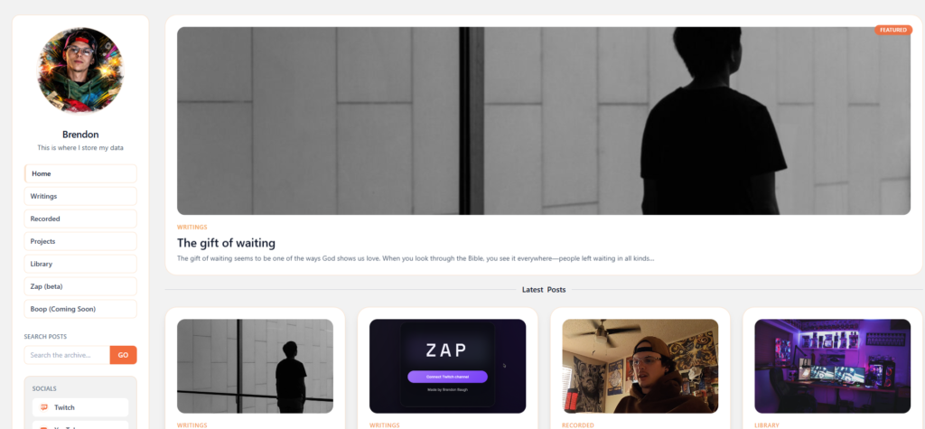
Over the past few weeks I tore down the visual system of 207.148.5.134/ and rebuilt it from the ground up. Same layout. Same structure. Completely new identity.
This update locks the site into a single, unified brand language. No more light/dark toggle. No more drifting palettes. Everything now runs through one core system: black, red, blue, and cream. High contrast. Intentional. Consistent across every page.
The goal wasn’t just to “refresh the look.” It was to remove visual indecision. A site that changes tone depending on mode starts to feel like multiple personalities stitched together. I wanted one voice.
The new palette is built around four anchors:
- Deep black as the base canvas
- Signal blue for interaction and structure
- Conviction red for emphasis and energy
- Cream as the neutral surface that keeps everything readable
This gives the site a NASA-clean feel: minimal, sharp, and direct. Red is used with restraint so it actually means something when it appears. Blue handles navigation and interaction. Black carries weight. Cream keeps it human.
Alongside the color rebuild, I introduced a new core mark: the split-heart logo.
Left side blue. Right side red. Divided by a rough seam.
It represents tension held together on purpose — logic and emotion, structure and chaos, discipline and creativity. Not a perfect heart. A real one. That mark will start appearing across the site, content, and future projects as the primary identifier.
I also began integrating photography and personal imagery more intentionally. The site isn’t meant to feel like a corporate shell. It’s a working lab. Code, media, experiments, and documentation all live here. The design now supports that without getting in the way.
This rebuild is phase one.
Next steps include:
- tightening typography and spacing across templates
- rolling the new system into project pages and case studies
- aligning video, stream, and social visuals with the same palette
- building out long-form documentation and logs inside this new framework
The layout you’ve seen stays. The foundation is now stable. From here on, updates are about refinement and expansion, not reinvention.
The site is finally speaking in one clear voice.