Overview
Cloud Gaming started as a small online shop selling controllers and retro accessories — a project fueled by pure love for gaming. But as the brand grew, it hit the same wall most passion projects do: the site didn’t match the vision. It looked dated, felt disconnected, and didn’t represent the energy behind the community.
When I stepped in, the goal was simple — turn Cloud Gaming into a world. Not just another store, but a visual experience that captured the spirit of anime, adventure, and play. Something that felt like booting up a console and stepping into a story.
Creative Direction
The redesign began with a single inspiration: One Piece.
That sense of wonder — sailing through endless skies, chasing freedom, and finding your crew — became the emotional backbone of the new identity.
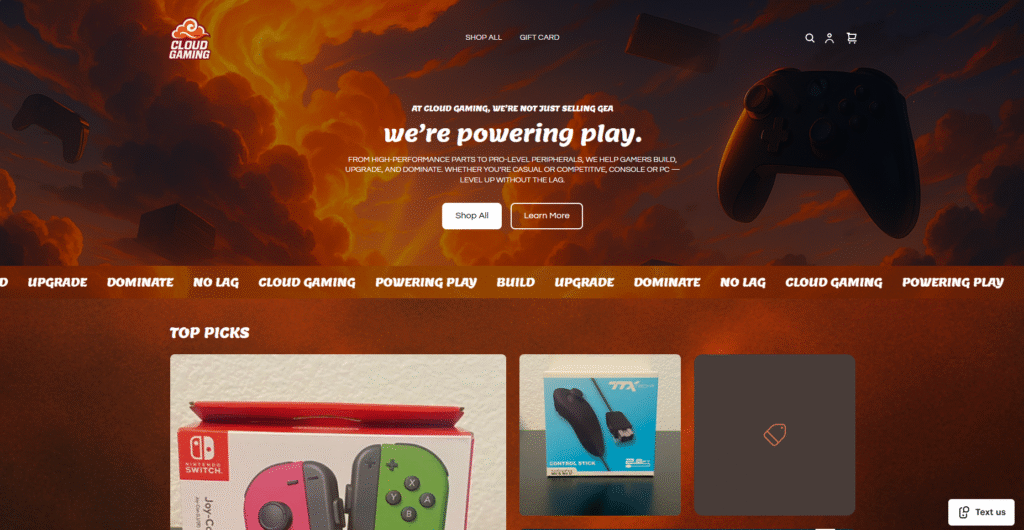
The palette draws from warm, glowing oranges and deep maroons, echoing sunset adventures at sea. The typography blends modern performance with nostalgic energy, while the overall design flow feels cinematic and inviting.
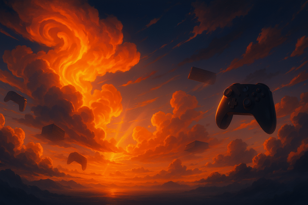
From the first scroll, the brand needed to feel alive. The site opens with a sweeping anime-style sky, glowing clouds shaped like energy waves, and drifting peripherals that set the tone for exploration and community.
Architecture
Cloud Gaming is built on Square’s ecosystem, which limits deep code access — but I treated that as a design challenge, not a blocker.
Working within those constraints meant focusing on hierarchy, atmosphere, and brand clarity. Every section was tuned for impact without relying on complex animations or scripts.
The layout now moves in smooth, cinematic layers:
- A hero section that sets the emotional tone with the “Powering Play” narrative.
- A scrolling marquee that loops the brand mantra: BUILD • UPGRADE • DOMINATE • POWERING PLAY • NO LAG.
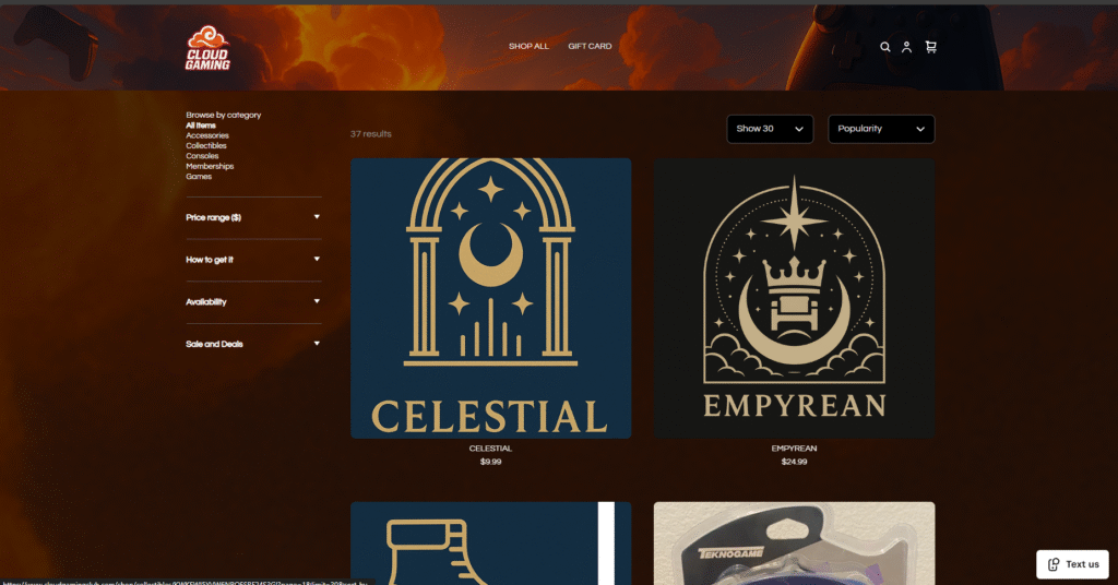
- A featured product grid re-framed with warm gradients and a subtle textured backdrop for depth.
The technical goal was to achieve a premium, anime-cinematic presentation without losing site speed or accessibility.
Design & UX
The biggest change was clarity. The old site had energy, but no direction. I restructured it around storytelling — guiding users through the brand like a quest.
- Banner: A cinematic 4K artwork inspired by One Piece’s sky — controllers and consoles drifting through radiant clouds.
- Why Cloud Gaming Section: Rewritten to explain purpose over products.
- Featured Items: Given visual hierarchy through soft gradients and contrast layering.
Everything feels custom, even inside Square’s framework.
Impact
The transformation was immediate.
Where the old site felt generic, the new design radiates identity. The banner now tells a story. The color flow connects every section. The brand finally looks as ambitious as the people behind it.
More importantly, it feels like Cloud Gaming now belongs in the same conversation as the brands it admires — built with intention, heart, and a bit of that anime-hero confidence
Reflection
This project reminded me how much storytelling lives inside design.
Even within limits, it’s possible to create a world that speaks louder than code.
Cloud Gaming isn’t just a storefront anymore — it’s a place where play feels like purpose.
And that’s the point. Whether you’re building a CRM or a gaming brand, the real win is when people feel something.